

Brand Book Design, Cases & How-To
Brand book
In branding, there’s a guide that knows every little detail about your brand, leading it to consistently express its unique identity across multiple platforms. That's exactly what a brand book does. It serves as the compass that helps navigate your brand through the challenges of branding.
A well-crafted brand book is more than just a manual. It's a master storyteller that narrates and depicts the vision of your brand, its ethos, personality, and values. A comprehensive brand book is the foundation of your brand, ensuring that the essence of who you are is embodied in every point of contact with your audience.

Key Brand Book Components
Stepping into the creative field of brand book design, let's introduce the key components that build up this comprehensive document. These key elements combined encapsulate the vision of a brand to help it capture the attention of the target audience. So, let’s see what makes a brand book complete.
Brand Logo
The logo is your brand's signature. It's the instantly recognizable symbol that distinguishes your brand in the marketplace. A well-designed logo is memorable and versatile. It helps your target audience remember who you are — just like the social media profile picture.
Reverse Logo
A reverse logo is an alternate version of your logo that can be used on different backgrounds to maintain legibility and brand integrity. Essentially, it's like the negative of your logo, usually involving a swap of colors.
Monochrome Logo
A monochrome logo is a single-color version of your brand logo, often black or white. This version can be used in situations where color printing isn't available, or the logo needs to be simplified for legibility at small sizes.
Logo Usage and Guidelines: Dos and Don’ts
This section of your brand book sets the rules for how your brand's logo can and can't be used. It includes guidelines on minimum sizes, clear space, acceptable color variations, and any modifications or distortions to avoid.
Typography
Typography includes the fonts and typographical elements your brand uses. This could be a single font family, or it could involve multiple fonts for headings, body text, and any other text elements.
Colour Palette
The colour palette refers to the specific set of colorus used in your brand's visuals. These colours should be clearly defined with specific colour codes (RGB, CMYK, Pantone, or HEX) for consistency across digital and print mediums.
Brand Colour Usage
This part of style guide outlines how your brand colours should be applied. It covers which colours to use for different elements, how to apply them for contrast and accessibility, and the balance between different colours.
Tone of Voice
Your brand's tone of voice defines how your brand communicates with its audience. It can be professional, friendly, authoritative, playful, or any other tone that aligns with your brand's personality.
Brochure Design Guidelines
Guidelines for brochure design define the layout, typography, colour usage, imagery, logos and other design elements that should be used when creating brand brochures.
Business Card and Letterhead Design
This section details the design guidelines for your business cards and letterhead. It ensures these vital business tools maintain consistency with your overall brand identity.
Imagery Usage Guidelines
Some visuals match your brand identity, while others don’t. These guidelines are supposed to draw the limits of how your brand presents and styles the images, and which ones to avoid.
Social Media Visual Guidelines
This one guides how your brand should visually represent itself on different social media platforms. It covers profile images, post layouts, use of logo, colour usage, and any platform-specific requirements.
With these core elements in place, your brand book becomes a valuable tool for your brand mission, telling your brand story and maintaining your brand image.
Leading Brands’ Cases
Let’s see how strong brands across different industries use their brand book elements to better communicate with their audience.
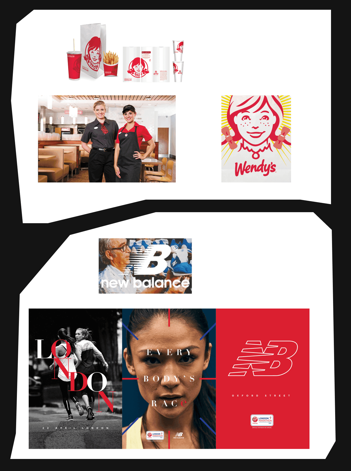
Wendy's
Everybody knows this fast food chain not just for the products and service quality. Famous for their square burgers and cheeky social media presence, their approach sealed in the brand book is a testament to their unconventional and customer-oriented approach.
Brand Logo
Wendy's logo, with its iconic image of a red-haired girl and playful typography, instantly sets the tone for their whole brand persona – friendly, warm, and approachable. The bright colours used in the logo, predominantly red and blue, are striking, easily recognizable, and reflective of the brand's energetic and dynamic personality.
Typography
The round and soft letterforms in the brand's primary typeface, along with its non-rigid alignment, give off a sense of whimsy and fun. The typography emanates general friendliness and a casual feel, which encourages us to think of the good times spent with Wendy’s.
Brand Colour Usage
The use of the primary colour in Wendy's branding is clever and effective. The dominant red signifies energy, warmth, and comfort, creating an inviting and friendly environment for their customers. Pops of yellow and blue add a touch of vibrancy, highlighting the lively spirit of the brand.
Tone of Voice
Wendy's tone of voice is humorous and encouraging, much like their overall branding. They're not afraid to engage in playful banter on social media or call out their competition. This builds rapport with their target audience and proves they don’t take themselves too seriously.
Social Media Visuals
When it comes to social media, Wendy's stays consistent with their branding while pushing the boundaries of creativity at the same time. Their visuals are bright and cheerful, with a heavy focus on showcasing their products in a fun and appetizing manner. But it's their clever captions and witty responses to comments that truly make them a standout brand on social platforms.
Wendy's illustrates the power of a cohesive and well-thought-out brand book. It ensures the vision that no matter where you interact with Wendy's, you're getting the same fun, friendly, and delicious experience.
New Balance
Let’s get into the sportswear sector with New Balance. Known for their comfortable athletic shoes and apparel, their brand book embodies their commitment to excellence, innovation, and performance.
Brand Logo
The New Balance logo is a perfect example of a simple design speaking volumes. The 'N' insignia instantly communicates the brand name while its clean lines and modern font speak to their dedication to innovation and design. The overall simplicity of the logo also mirrors the brand's focus on functionality and performance.
Typography
New Balance uses a modern and clean typeface that gives off a sense of simplicity and sophistication. The typography is strong and bold, reflecting the strength and determination that New Balance aims to instill in its customers.
Brand Colour Usage
The minimalist colour scheme that uses of white, black, and grey, aligns with the brand's values of simplicity and functionality. However, they also incorporate pops of vibrant colour, which adds some more energy and character to their branding and reflects their innovative spirit.
Tone of Voice
The New Balance tone of voice is motivational, inspiring, and slightly competitive. This aligns perfectly with their core demographic of modern active people, fitness enthusiasts, and athletes all over the world. Their messages often empower their customers, encouraging them to overcome obstacles and push their limits.
Social Media Visuals
Excellence in action — that seems to be the motto of the way New Balance use their social media visuals. Their visuals often depict not only athletes but most importantly, average people just like us, mid-performance, using dynamic angles and high-energy settings. This, coupled with the brand's motivational messaging, creates a powerful narrative of performance, resilience, and the joy of sport and active lifestyle.
By consistently applying core values across their logo, typography, colour usage, tone of voice, and social media visuals, New Balance has built a robust and respected brand that resonates with people who prefer to stay active around the globe.
The Journey to a Brand Book: From Initial Planning to Final Design
Crafting a brand book is a journey into the very heart of your brand. It's like assembling a mechanism, where each part connects to form a vivid, cohesive picture of your brand. Let's see how it’s created.
Briefing and Brand Analysis
The adventure begins with a thorough understanding of your brand. This phase involves intensive research, which includes studying your target audience, analyzing your competitors, and understanding your brand's position in the market. The goal is to collect a wealth of information that will act as the foundation of your brand book.
Concept and Creation
Based on the brand analysis, we begin brainstorming and conceptualizing ideas for your brand book. This is where creativity and inspiration really blooms! We consider how to visually represent your brand's core attributes, thinking about your logo, colour palette, typography, and other visual elements. We also draft your brand's voice and tone, ensuring it aligns with your identity and resonates with your audience.
Design Development
Once the initial concepts are ready, we start breathing life into them. This stage involves developing the chosen ideas into concrete designs. Each element is meticulously crafted, ensuring it perfectly mirrors your brand's personality. The designs undergo multiple revisions and refinements, evolving gradually until they align seamlessly with your brand vision.
Approval and Finalization
Now, the designs and content are ready for review. At this stage, we present the brand book draft to the decision-makers. We gather feedback, make necessary adjustments, and ensure every detail aligns with your brand goals. Once the brand book meets your expectations and receives the green light, we finalize the design. Voila! Your brand book is ready.
As your brand grows and evolves, your brand book should reflect changes, ensuring it always remains the true compass of your brand's identity.
Diving into the Toolbox: The Technical Aspects of Brand Book Design
Like a skilled artist, a brand designer should possess an arsenal of design tools to craft an effective brand book. But it's not just about creativity as is; a huge part of brand book design involves a technical understanding of various design software.
In brand book design, certain software has proven indispensable. Let’s examine the example of the Adobe suite. These are like the designer's best friends, aiding in every step of the brand book creation process:
Adobe Illustrator
An essential tool for logo design and vector graphics. Illustrator allows for the creation and editing of intricate designs that can be resized without losing quality – a key requirement for versatile brand elements.
Adobe Photoshop
This one is perfect for photo editing. If your brand book contains a lot of imagery, Photoshop will ensure they are polished and professional, resonating perfectly with your brand aesthetic.
Adobe InDesign
For layout design and typography, InDesign reigns supreme. It's used to assemble all brand elements into a coherent, well-structured brand book. It's where the magic truly comes together!
Each software has its unique strengths, and understanding how to use them in unison is vital in the brand book design process. Make sure the design team is proficient in these tools to create a stunning brand book that will translate your brand identity just the way you envision it.
Finer Details: Layout in Brand Book Design
Just like an eloquent speaker, a well-crafted brand book communicates with clarity and confidence. That’s achieved through meticulous layout design and strategic typography usage, a brand book can guide its readers seamlessly, making the brand narrative as engrossing as it is insightful.
Structure is Key
Maintain a consistent structure throughout the brand book. This creates a rhythm that guides the reader's journey, allowing them to digest information more easily.
Whitespace is Your Friend
Effective use of whitespace can make your layout appear clean and professional. It prevents the design from feeling too dense and allows for the information to breathe.
Flow Like a River
Your layout should guide the reader through the content in a natural, intuitive flow. This can be achieved through strategic use of lines, shapes, and placement of elements.
Typography Talks
Typography isn't merely about selecting a pretty font; it's a crucial aspect of visual communication. It can evoke emotions, set the mood, and even influence perceptions about your brand. Consider these best practices for typography:
Font Choice
Choose fonts that reflect your brand's personality. Be consistent in their use across different sections and mediums.
Hierarchy
Use different font sizes and styles to establish a hierarchy of information. Titles, subheadings, and body text should be distinct yet harmonious.
Legibility
Always prioritize legibility. Be it print or digital, you should be sure that the fonts you use are accessible and ready to comprehend.
Line Spacing and Length
Avoid long lines of text and maintain appropriate line spacing. This ensures a comfortable reading experience.
In essence, layout and typography play a pivotal role in enhancing the readability, appeal, and overall effectiveness of your brand book. Mastering these elements can turn your brand book from a mere style guide to a compelling brand story.
Painting with Imagery and Colours in Brand Book Design
A brand book is more than a collection of rules. It's a showcase of a brand's unique personality and a glimpse into its world. And, like any good storyteller, it often relies on vibrant imagery and a carefully curated colour palette to spin its tales. An image speaks a thousand words, and nowhere is this truer than in a brand book.
Storytelling
Images can help narrate your brand story in a way that resonates with your audience. They should reflect your brand or company's purpose, ethos, values, and style.
Coherency
Just like typography and layout, imagery should maintain consistency across all mediums to establish brand recognition.
Engagement
Striking visuals captivate readers, making your brand book more engaging and memorable.
Creating Harmony with Colours
Colours are silent yet persuasive storytellers. They trigger emotions and associations, influencing how a brand is perceived. Here's how to use colours effectively in your brand book:
Colour Palette
The chosen colours should reflect your brand's personality. Think about what each colour communicates and how it aligns with your company's core values and brand message.
Contrast and Balance
Contrasting colours can highlight important elements, while a balanced use of primary and secondary colours can ensure your design isn't overwhelming.
Accessibility
Ensure your colour palette is accessible, i.e., legible and distinguishable to people with different types of colour vision deficiencies.
Images and colours are not just decorative elements. They are potent tools for conveying your brand's vision and values. Use them wisely to turn your brand book into a masterpiece that captures the essence of your brand.
Making Your Brand Book Work for You
Brand books are the compass guiding your brand's journey. They are vital in ensuring a consistent identity and tone across various platforms and touchpoints. But creating a brand book is just the beginning; the real challenge lies in implementing and maintaining it effectively.
Step 1: Educate and Communicate
Once your brand book is ready, familiarize your team with it. Host a workshop or meeting where you explain each aspect of the brand book. Highlight the importance of brand consistency and how each member can contribute.
Step 2: Promote Internal Use
Make sure everyone in your organization has easy access to the brand book. Whether they are creating a sales presentation or a social media post, they should refer to the brand book to ensure they're on brand.
Step 3: Check for Relevance
Relevance is key to building brand recognition. Regularly audit your brand's communications across all external communication channels, to ensure alignment with your brand book. This could involve checking website content, social media posts, marketing emails, or any other brand materials.
Step 4: Adapt and Update
As your company grows, your own brand guide itself might evolve too. This doesn't mean your brand book becomes irrelevant. Instead, consider it a living document that grows with your brand. Regularly revisit and update your brand book to reflect any changes in your brand or company's vision, values, or aesthetics.
Step 5: Involve Your Audience
Your audience can be great custodians of your brand. Involve them in your brand's journey by sharing snippets from your brand book or stories about your brand's evolution.
Treat the management behind implementing and sticking to your brand book as a key project and not a one-off task. Properly implemented and maintained, your brand book can be the key element to your brand's long-term success.
Maintaining Consistent Communication Between Designers and Marketers
Open and effective communication between designers and marketers is pivotal in maintaining the brand book project. Your brand book serves as a shared language and communication guidelines, a comprehensive reference guide, and a mediator between these marketing professionals.
Designers are the architects of your brand's visual identity, while marketers lead how that identity interacts with the world. When both teams align their efforts around a well-structured brand book, magic happens. How do you ensure this synergy?
Regular Meetings
Encourage routine check-ins and creative collaborations between the design and marketing teams. Here, they can discuss ongoing projects, future campaigns, and any brand-related queries or updates.
Shared Access
Ensure that everyone has easy access to the most updated version of the brand book. This eliminates confusion and promotes uniformity in all brand communications.
Training
Regular training sessions can help both teams fully understand the brand book's contents and their significance. This empowers them to make informed decisions that reflect your brand accurately.
The Role of a Brand Book in Ongoing Brand Management
A brand book isn’t a one-and-done document. It's a dynamic tool that should actively participate in your ongoing brand management. Your brand may evolve, the market may shift, and new branding trends may emerge. Your brand book should adapt to these changes, making it an essential resource for long-term brand management.
To capitalize on your brand book in brand management, here are some tips:
Regularly Update
Revisit your brand book periodically to ensure it's up-to-date with your brand's growth and the industry's trends.
Use it as a Launchpad
When brainstorming for new campaigns or products, always start with your brand book. It should be the foundation of your brand guideline and all your creative strategies.
Educate Your Team
Make sure everyone in your organization understands the brand book and why it's important. The more familiar your team is with the brand book, the more efficiently they can implement it in their work.
In a world where consumers face a huge variety of content and choices, a consistent and authentic brand can stand out. By keeping your brand book at the heart of your brand management, you ensure your brand resonates clearly and compellingly, now and in the future.
Outsourcing Brand Book Creation
An outside perspective can be a breath of fresh air for your team. Outsourcing your brand book creation to a competent agency could bring new creative experience and strategic insights to your brand.
Branding agencies live and breathe brand strategy. They understand the nuances of brand communication, latest design trends, and the art of crafting compelling brand narratives. Leveraging their expertise can result in a brand book that's comprehensive, innovative, and future-proof.
Creating a brand book is a time-consuming process. Outsourcing it frees up your team's time to focus on what they do best, ensuring efficiency across your operations. An external team also brings an unbiased lens to your brand. They might see opportunities and ideas that internal teams might overlook due to their proximity to the brand.
Explore the portfolio of brands Bolder Agency has already helped bring their boldest ideas to life. We are ready to make it happen with you whenever you are!


