
How climate tech brands use data visualisation to build trust
Climate technology companies are leading a global transition towards sustainability, yet their biggest challenge often lies not in innovation but in communication. The technical nature of their work means that complex data, massive amounts of scientific metrics, and performance indicators are often difficult for wider audiences to understand. Investors, policymakers, and clients all want proof of impact, and data-driven decisions can be enhanced by visualising raw figures, as dense reports rarely create engagement.
This is where data visualisation becomes essential. When presented well, climate data can do more than inform useful information, it can inspire. Through clear, accessible, and visually engaging storytelling, climate tech brands can show how their technology drives measurable progress towards a sustainable future.
Understanding the importance of using data visualisation to communicate the technical impact of climate tech brands is crucial for credibility, trust, and long-term business growth.
Why climate change data visualisation matters for climate tech brands
Explaining complex sustainability metrics clearly to investors, stakeholders, and clients
Climate change visualisation transforms highly technical datasets into accessible narratives that reveal complex relationships between various factors. Metrics such as carbon reduction, renewable energy production, or avoided fossil fuel use can be effectively communicated through graphical representations in a way that both technical and non-technical audiences can understand.
In recent years, when presented through intuitive visuals, complex information has become more transparent and accessible. Investors can identify progress, stakeholders can see value, and clients can grasp how technology directly contributes to climate solutions.
Building trust through transparency in climate-related reporting
Transparency is a key component of credibility in sustainability communications. Visualising emissions data, energy consumption, and other climate-related metrics provides tangible evidence of progress. Interactive dashboards or simple graphs help stakeholders track performance in real time, demonstrating accountability and genuine action.
By turning raw numbers and data sets into visual elements, companies reinforce their commitment to measurable impact and their services rather than aspirational statements.
Using visual storytelling to drive engagement and awareness
Data visualisation helps create an emotional connection. Graphs and charts convey an essential message that they are visual storytelling devices that make audiences feel the significance of change. A simple visual comparison showing the reduction of emissions year after year can speak volumes about dedication and consistency.
Visual storytelling enables marketing teams to engage global audiences through simplicity and authenticity, promoting sustainable branding across all channels.
Types of data visualisation that showcase technical impact
Interactive dashboards and real-time climate data trackers
Interactive dashboards present live data from multiple sources in a single interface. They enable users to track progress on emissions, energy consumption, and efficiency gains globally. For instance, a dashboard that visualises daily energy output from solar installations gives audiences a direct understanding of the brand’s positive impact on the environment.
These dashboards also enable companies to provide updates about their services to investors and partners, supporting data analysis-driven decisions and strategic transparency.
Infographics highlighting carbon footprint reductions and energy efficiency gains
Infographics are highly effective for summarising climate data. They use clear icons, colour-coded visuals, and comparative charts to communicate reductions in carbon footprint while contributing to increases in renewable energy generation.
When designed for accessibility, these visualisations can provide valuable insights to help businesses reach audiences beyond technical experts, supporting education, advocacy, and marketing objectives simultaneously.
Charts and graphs for comparative analysis of climate solutions
Traditional graphs remain powerful tools for analysis and communication. Line graphs can track emissions over time, for example, while pie charts can visualise the distribution of energy sources or resource usage across projects.
Bar charts comparing the performance of different climate technologies, such as solar, wind, and hydrogen, help highlight measurable progress and identify patterns that may inform future strategy with various examples.
Sector-specific visualisations tailored to unique sustainability challenges
Each sector within the climate tech landscape faces different challenges. A company focusing on sustainable agriculture may visualise water use efficiency, while an organisation in clean transport may track emissions per kilometre.
Sector-specific visualisations ensure relevance and clarity by aligning data presentation with the brand’s main goal and audience expectations.
Best practices for effective climate change data visualisation
Keep graphics simple and tailored to audience knowledge levels
The goal of visualisation is understanding, not complexity. Graphics should focus on key trends and insights and avoid overloading the viewer with unnecessary details. Different audiences require varying levels of depth, so each visual should be created with its intended users in mind, ranging from technical experts to policymakers and the general public.
Use colour coding to highlight key insights
Colour plays a vital role in presenting data effectively. Using consistent shades to represent climate change progress or risk helps viewers interpret visuals intuitively. For example, dark red can indicate high emissions or critical thresholds, while green can represent energy savings or reduced carbon output.
Consistent colour schemes across all visuals help create data brand coherence and strengthen recall.
Balance technical precision with clarity and accessibility
Accurate representation of data is non-negotiable, but clarity must always come first to help audiences understand trends. Including too many technical markers or jargon can obscure meaning. Instead, visuals should summarise findings clearly, with notes or references available for those seeking additional information.
A good visual bridges the gap between scientific rigour and broad accessibility.
Incorporate narrative elements to strengthen engagement
Data becomes meaningful when placed in context. A visual should always tell a story: what changed, why it matters, and how it affects the planet. Pairing visual elements with short captions or annotations can guide interpretation, helping audiences connect emotionally and intellectually.
Recommended tools: Tableau, Power BI, D3.js, Flourish
A growing number of data visualisation tools enable brands to create professional, interactive visuals with minimal technical barriers.
• Tableau and Power BI are popular choices for corporate dashboards that update in real time.
• D3.js enables the creation of custom, interactive charts for web-based storytelling.
• Flourish offers accessible templates ideal for marketing teams and sustainability reports.
Selecting the right visualisation tool depends on available resources, target audience, and intended communication platform.
Common pitfalls when communicating climate data
Overloading visuals with excessive technical details
Too much data can be confusing rather than clarifying. Overcomplicated charts or crowded dashboards dilute the message. The most effective visualisations focus on one key insight at a time.
Failing to contextualise figures within wider industry benchmarks
Data is most meaningful when presented in relation to something else, offering a better understanding of progress. Comparing results against industry averages or global targets helps audiences understand progress. Without context, even impressive numbers can lack impact.
Using inconsistent scales or metrics
Inconsistency in measurement or visual scale can mislead viewers. Standardising scales and ensuring data comparability across all visuals prevents confusion and improves credibility.
Ignoring audience understanding can lead to potential misinterpretation
Visuals created for technical audiences often fail to engage the general public. Every visualisation must consider what the audience already knows and what they need to learn. This prevents misinterpretation and supports genuine understanding.
Leveraging data visualisation for growth and trust-building
Aligning data storytelling with brand purpose and leadership goals
Every climate tech company’s data tells a story about its commitment to sustainability and highlights trends in its progress. When that story aligns with leadership vision and corporate values, it strengthens credibility. Data visualisation helps express purpose clearly, showing how measurable outcomes align with brand strategy.
Supporting marketing strategies, investor relations, and partnerships
Data visualisation plays an increasingly strategic role in marketing and stakeholder communication. Marketing teams use visual storytelling to demonstrate the impact and authenticity of their brand. For investors, dashboards offer transparency and reliable updates. For partners, visual insights support collaboration and trust.
Demonstrating measurable climate impact to attract purpose-driven talent
Companies that communicate their progress visually often attract employees who value sustainability and environmental responsibility. Sharing progress on emissions reductions, renewable energy projects, and efficiency milestones makes the company’s mission visible and tangible.
Case studies of successful climate tech brands effectively using data visualisation
Several leading organisations have integrated data storytelling into their brand communications:
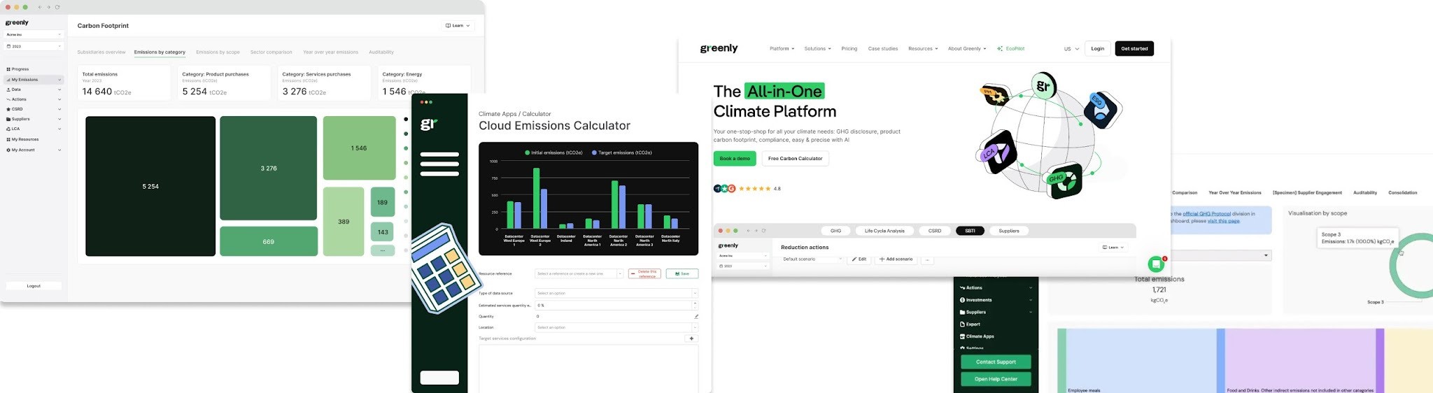
1. Greenly: Carbon accounting dashboard and enterprise visualisation
• Greenly is a Paris-based climate tech company that offers carbon accounting software for businesses.
• Their platform includes dashboards where companies can visualise their emissions (Scopes 1, 2, and 3), identify major sources, and model reduction pathways.
• By converting raw carbon emissions data, utility bills, supply-chain metrics, and other relevant data into accessible visual formats, Greenly helps its clients understand their current position and the necessary actions to take.
• This kind of visualisation supports transparency, helps attract investors/partners, and strengthens the brand’s credibility by showing measurable progress rather than vague claims.
2. Sust Global: Climate risk analytics & interactive visualisation platform
• Sust Global has created a “Climate Explorer” platform offering geospatial data, scenario modelling, and real-time climate risk visualisations for portfolios.
• Their visualisations include maps, heat maps of risk zones, and dashboards of climate hazard exposure, enabling finance, insurance, or asset management clients to evaluate risk visually.
• By visualising climate-related data in an engaging way, Sust Global enables clients to make decisions with greater awareness, supports storytelling about impact, and helps the brand position itself as a trusted analytics partner.
3. Australian National University (Energy Dashboard case): Example of climate tech visualisation in practice
• Although not a private startup brand, ANU’s case with the Qlik Sense “Energy Dashboard” is instructive. It combines real-time local weather and building energy consumption to visualise efficiency gains and patterns.
• This sort of visualisation helps technical audiences and non-technical stakeholders alike recognise patterns of energy consumption, reveals savings opportunities, and supports institutional credibility.
• Climate tech brands can learn from this: presenting operational data (energy, usage, savings) visually supports proof of impact and fosters trust among clients and partners.
Key takeaways from these case studies
• Visualisation turns complex climate data (emissions, risk, energy) into digestible insight.
• Dashboards, maps, and interactive tools support stakeholder engagement (investors, partners, clients).
• Transparent visual data builds credibility and supports brand positioning in the climate tech space.
• Not every visual needs to be highly technical: clarity, context, and story matter.
• Brands that integrate data visualisation into their communication (marketing, investor relations, partnerships) gain a competitive advantage.
Conclusion
Data visualisation has become a crucial tool for climate tech brands that aim to communicate complex information with clarity and impact. By transforming dense datasets into accessible narratives, organisations can show measurable progress, build trust, and inspire genuine engagement across audiences.
Whether through interactive dashboards, simple infographics, or storytelling graphs, the right visualisation helps climate data speak for itself. It connects the technical side of innovation with the emotional drive for a sustainable future.
For climate-focused businesses, the ability to visualise data effectively is no longer optional, but it is fundamental to credibility, influence, and long-term brand growth.
FAQs
Why is data visualisation important for climate tech brands?
Data visualisation helps climate tech companies explain complex technical information clearly. Instead of long tables or dense reports, visual elements such as graphs, charts, and dashboards show progress on emissions reduction, renewable energy use, and efficiency gains. This makes climate impact understandable for investors, partners, and the public, while reinforcing brand transparency and credibility.
How does data visualisation help communicate sustainability progress?
By transforming quantitative data into clear visuals, brands can effectively demonstrate measurable outcomes in an engaging manner. For example, an interactive dashboard can display reductions in carbon footprint or energy use over time. These visuals support open communication, make progress accessible to all stakeholders, and help drive collective action towards a sustainable future.
What are the best data visualisation tools for climate tech communication?
Popular tools include Tableau and Power BI for creating interactive dashboards, D3.js for custom, web-based visualisations, and Flourish for storytelling graphics that integrate easily with websites or reports. The right choice depends on your audience, data complexity, and communication goals.
How can climate tech companies avoid misinterpretation when visualising data?
To avoid confusion, companies should:
• Keep visuals audience-specific and straightforward
• Use consistent scales and units across visuals
• Add short narrative explanations or context for key figures
• Reference credible data sources such as the Intergovernmental Panel on Climate Change or national climate databases
Clarity and context are essential for building trust and ensuring accuracy.
How does visual storytelling influence brand perception in the climate tech sector?
Visual storytelling humanises technical innovation. When a company presents its climate data through accessible, emotionally resonant visuals, it shows both transparency and purpose. This approach helps audiences connect with the brand’s mission, increases engagement, and differentiates the organisation in a competitive sustainability landscape.