-min.png)


.svg)

.svg)
/01
PixelAdmin was born from real-world creative chaos. After years behind the lens, Sebastian kept facing the same headache: scattered feedback and endless file transfers after every shoot. Teaming up with developer friend Milos, they set out to build one seamless platform for creative proofing and feedback, eliminating the mess, once and for all.
/Solutions
/Industry
#TECH
#SAAS
#B2B
/02
The client wanted to aim for the perfect middle-ground between being cool, modern and tech looking, while maintaining a professional look that does not scare the more conservative consumers but still stands out from competitors.
/03
Create brand identity that hits the perfect middle-ground between being cool, modern and tech looking
Represent that fine line where it is not too much but it’s also not boring.
-min.jpg)
/04
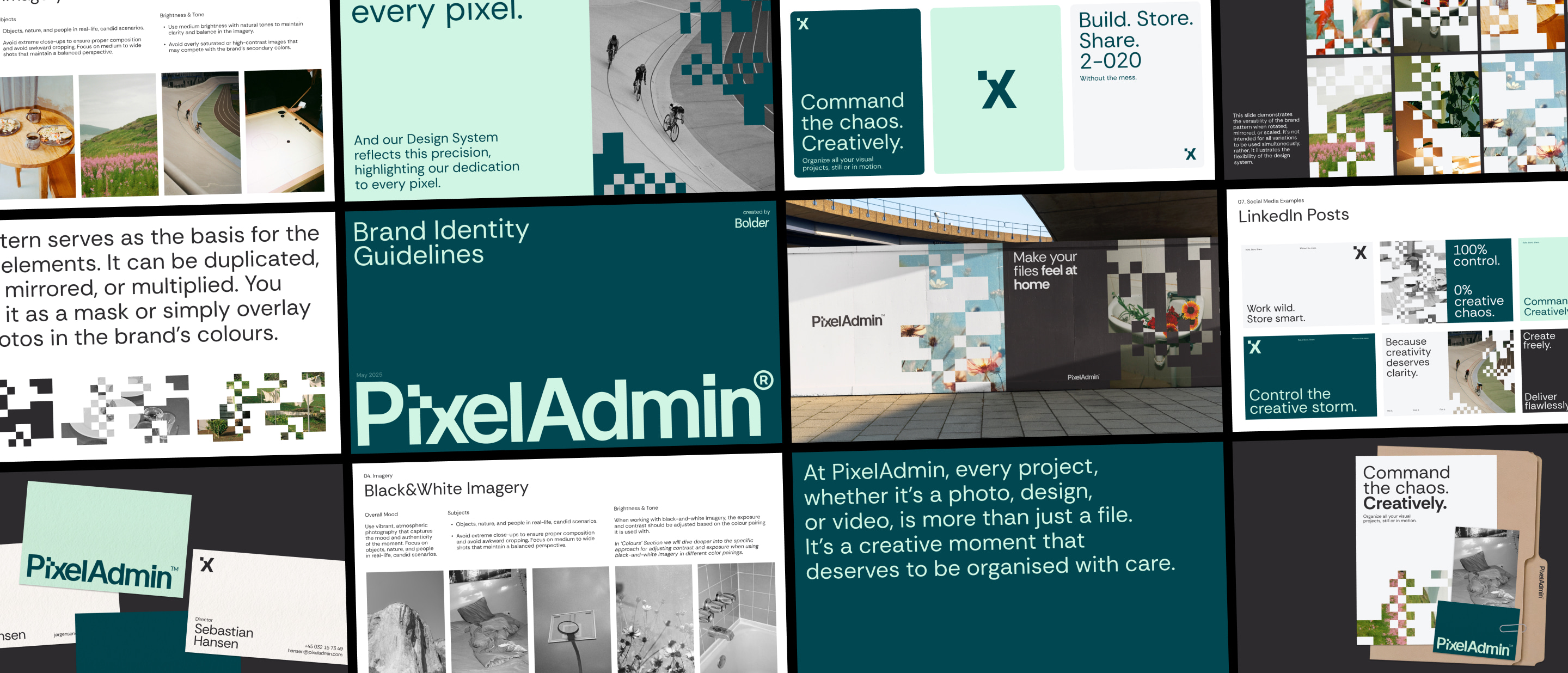
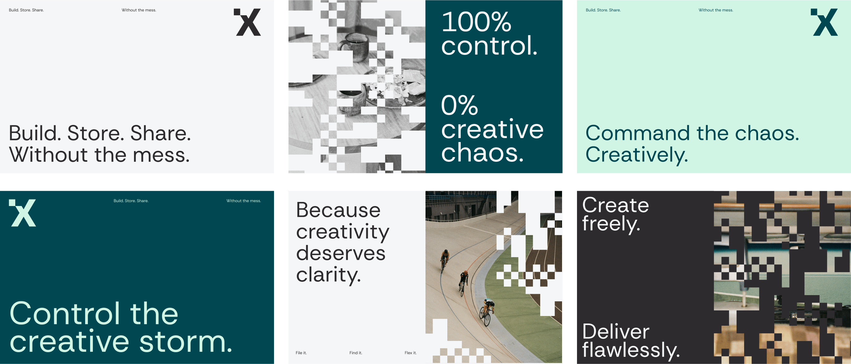
At PixelAdmin, every project, whether it's a photo, design, or video, is more than just a file. It's a creative moment that deserves to be organised with care.
Care for every pixel.
And our Design System reflects this precision, highlighting our dedication to every pixel.
-min.png)
.png)
-min.jpg)
/05
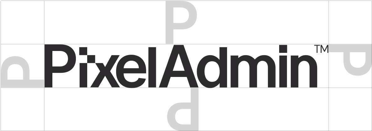
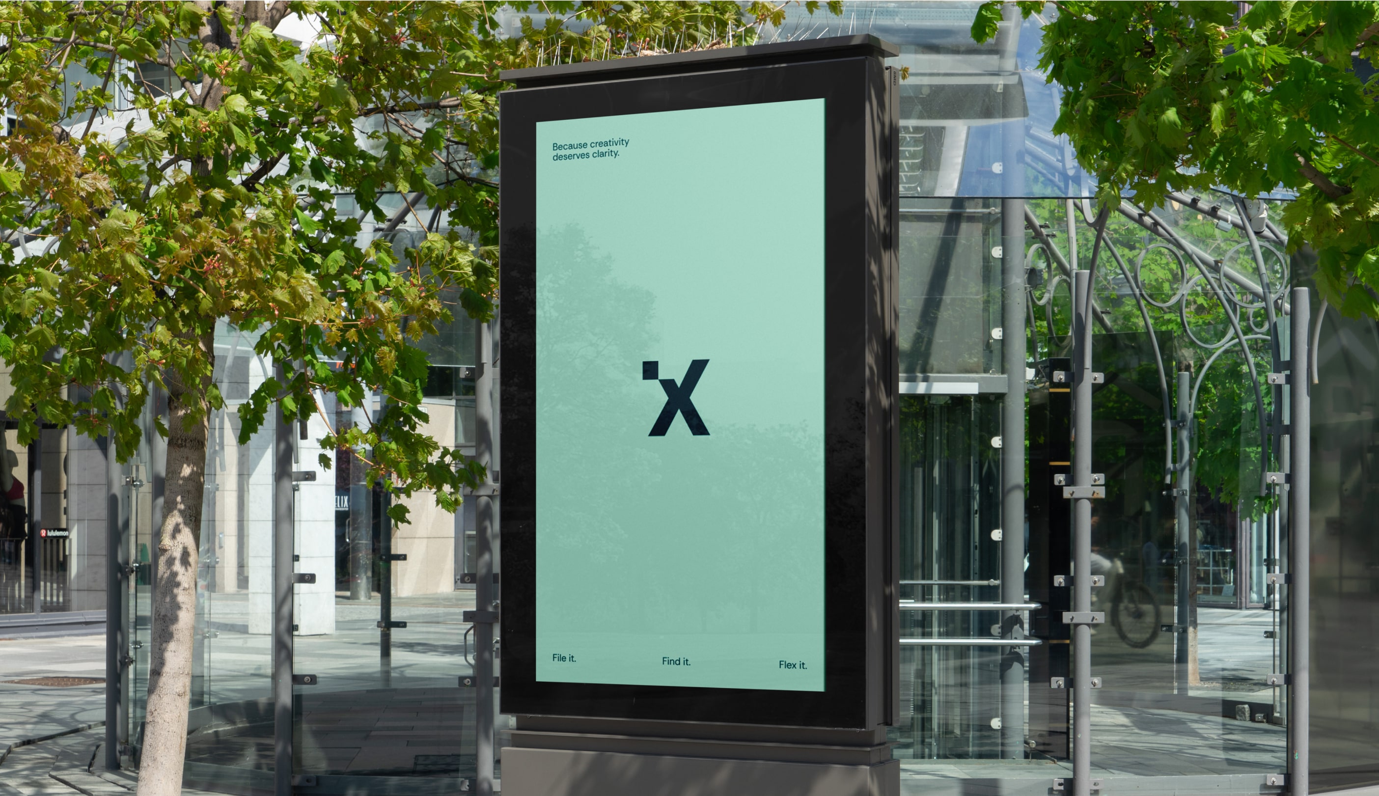
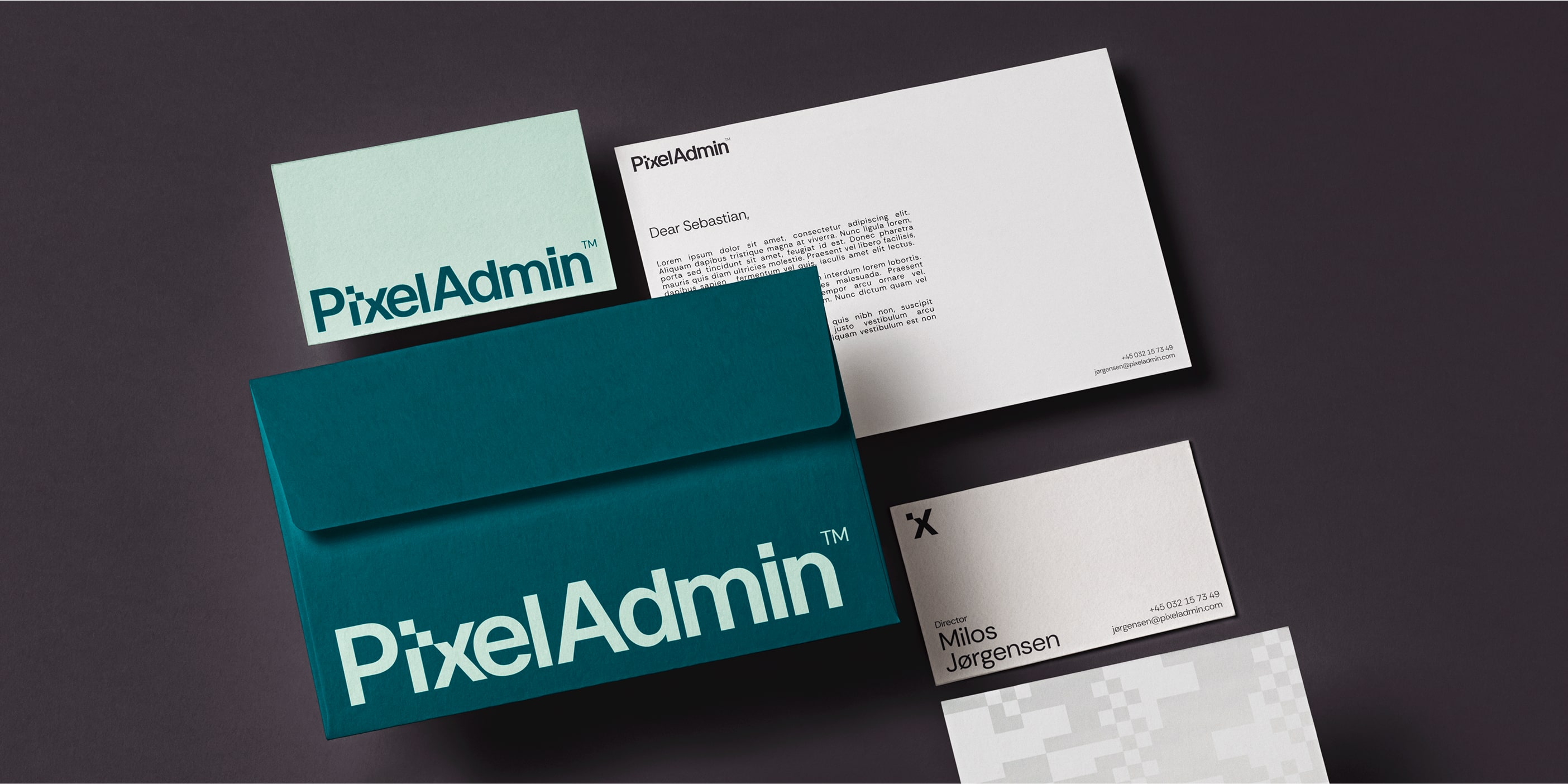
The wordmark is built on a simple, sans-serif foundation, but with a distinctive twist. In the letter "x," one pixel is subtly shifted toward the "i," creating a clever visual hook through the use of negative space.

/06
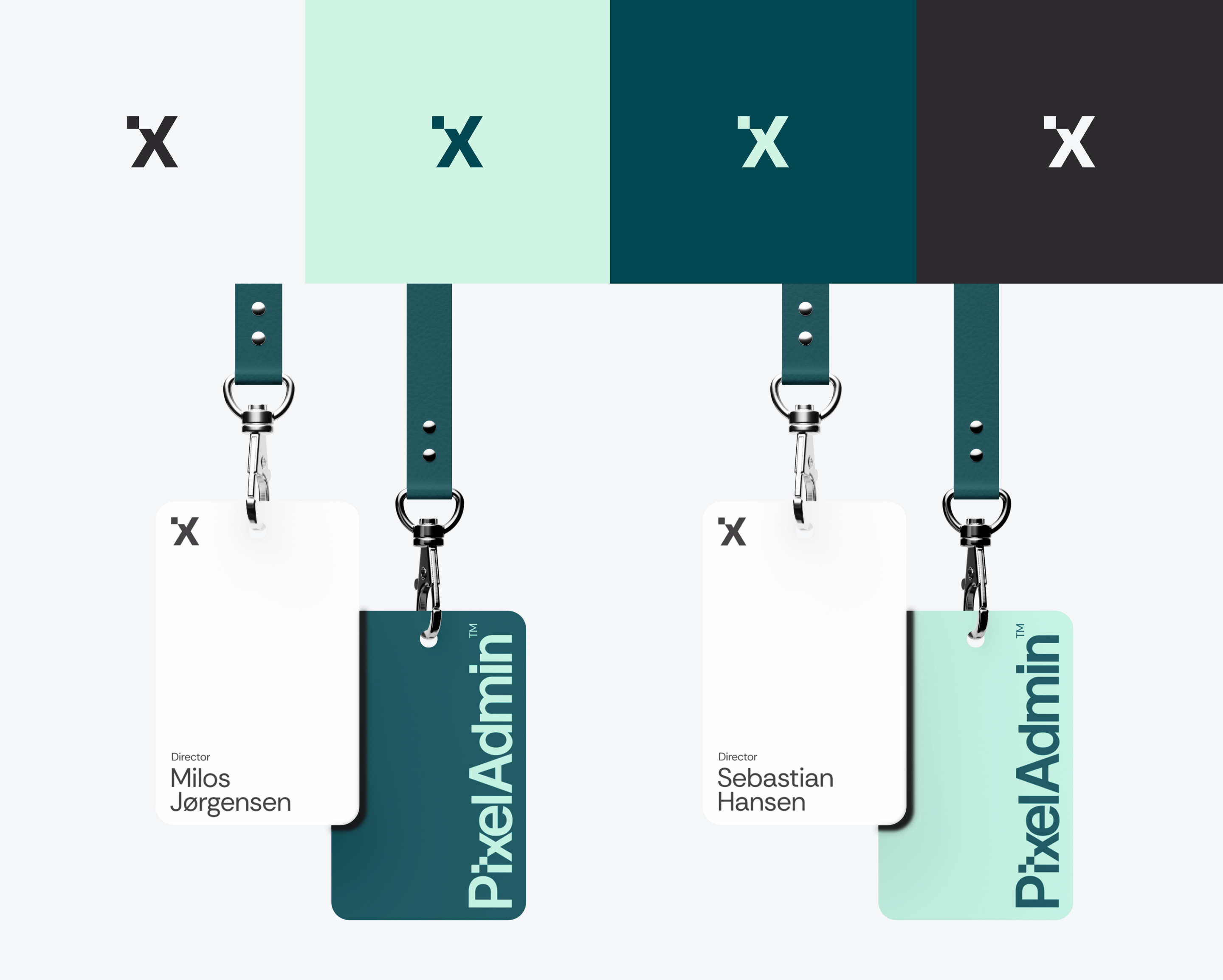
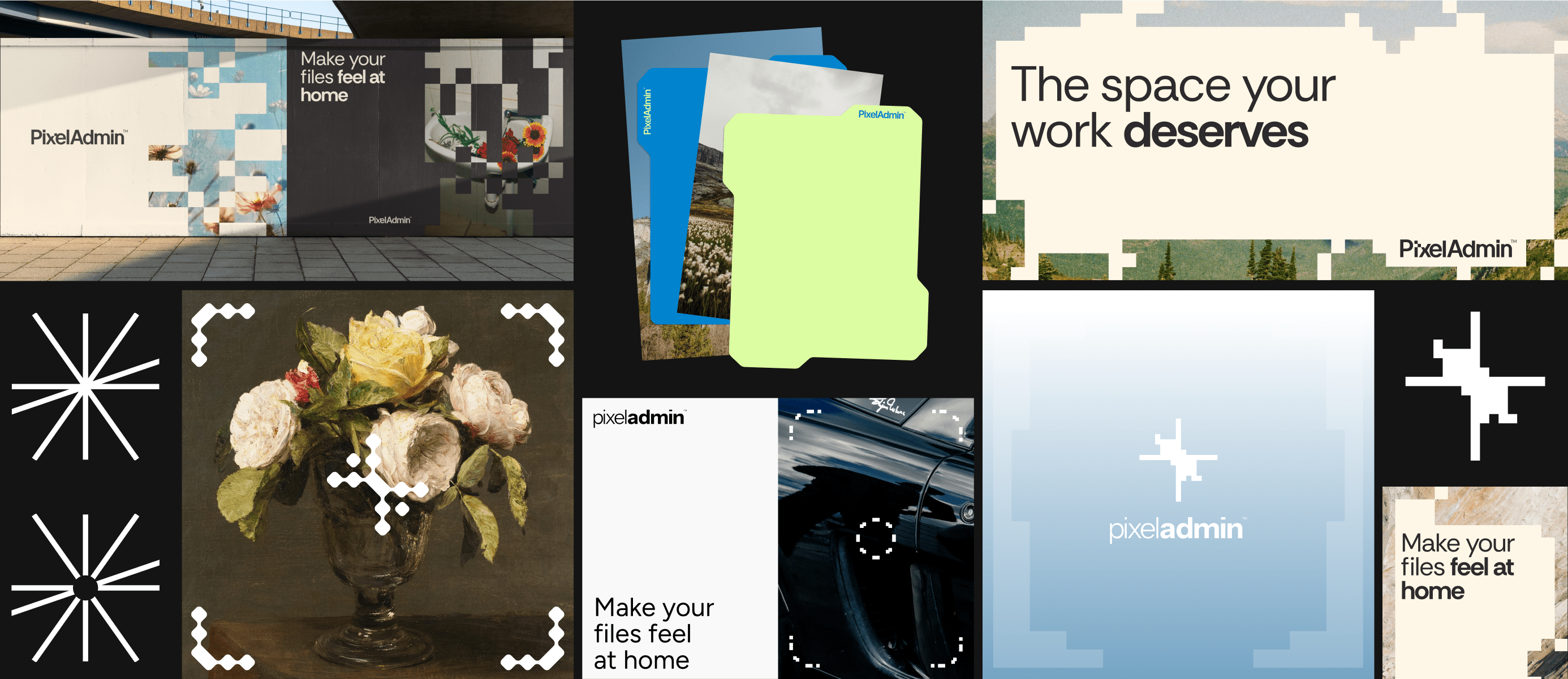
The modified "x" from the wordmark serves as a strong, standalone symbol for the brand, offering additional flexibility and recognition.
Brand Icon can be used as a standalone element or as a subtle accent in the corner of an image.
When used alone, it serves as a clear, recognisable representation of an action or idea. As a small corner element, it complements the design without overpowering the main content.
/07
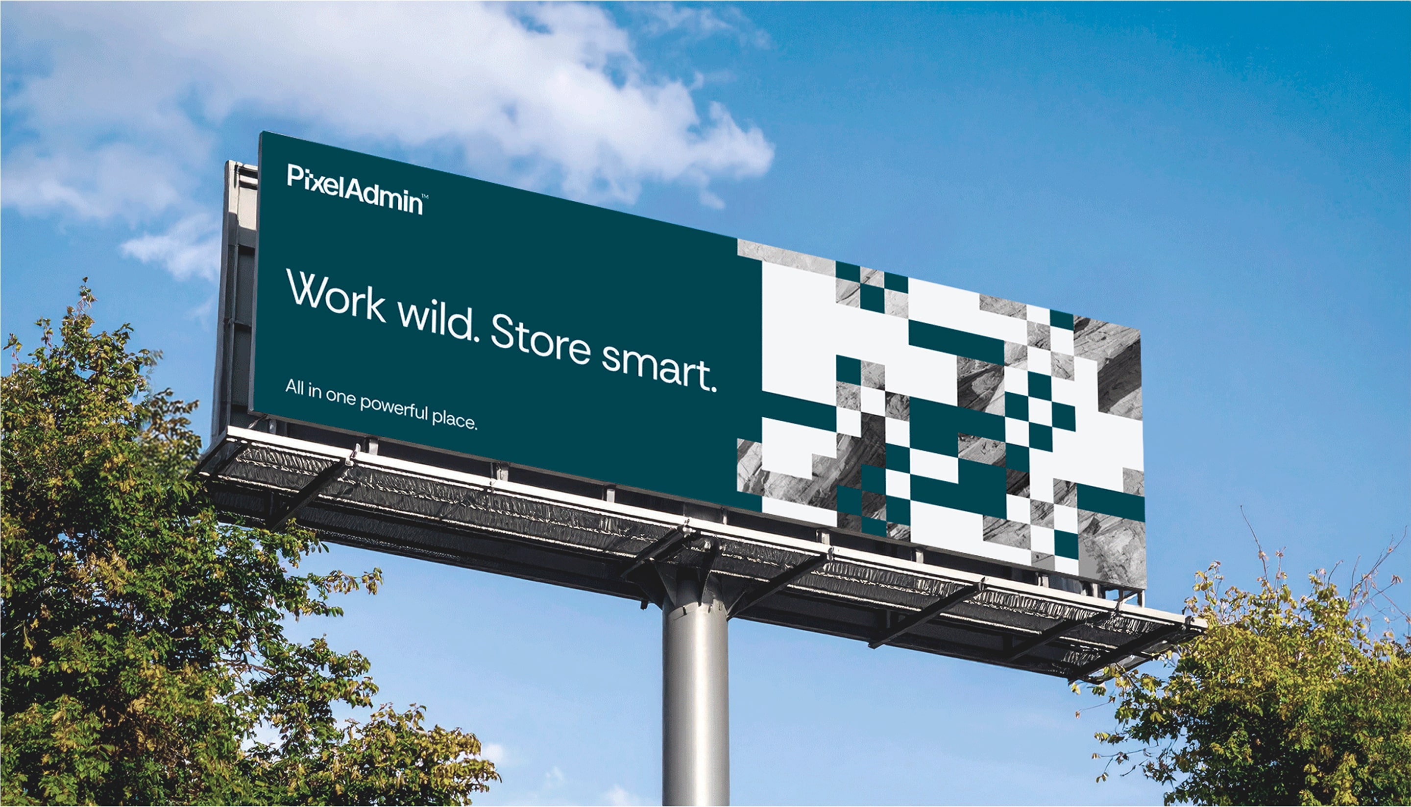
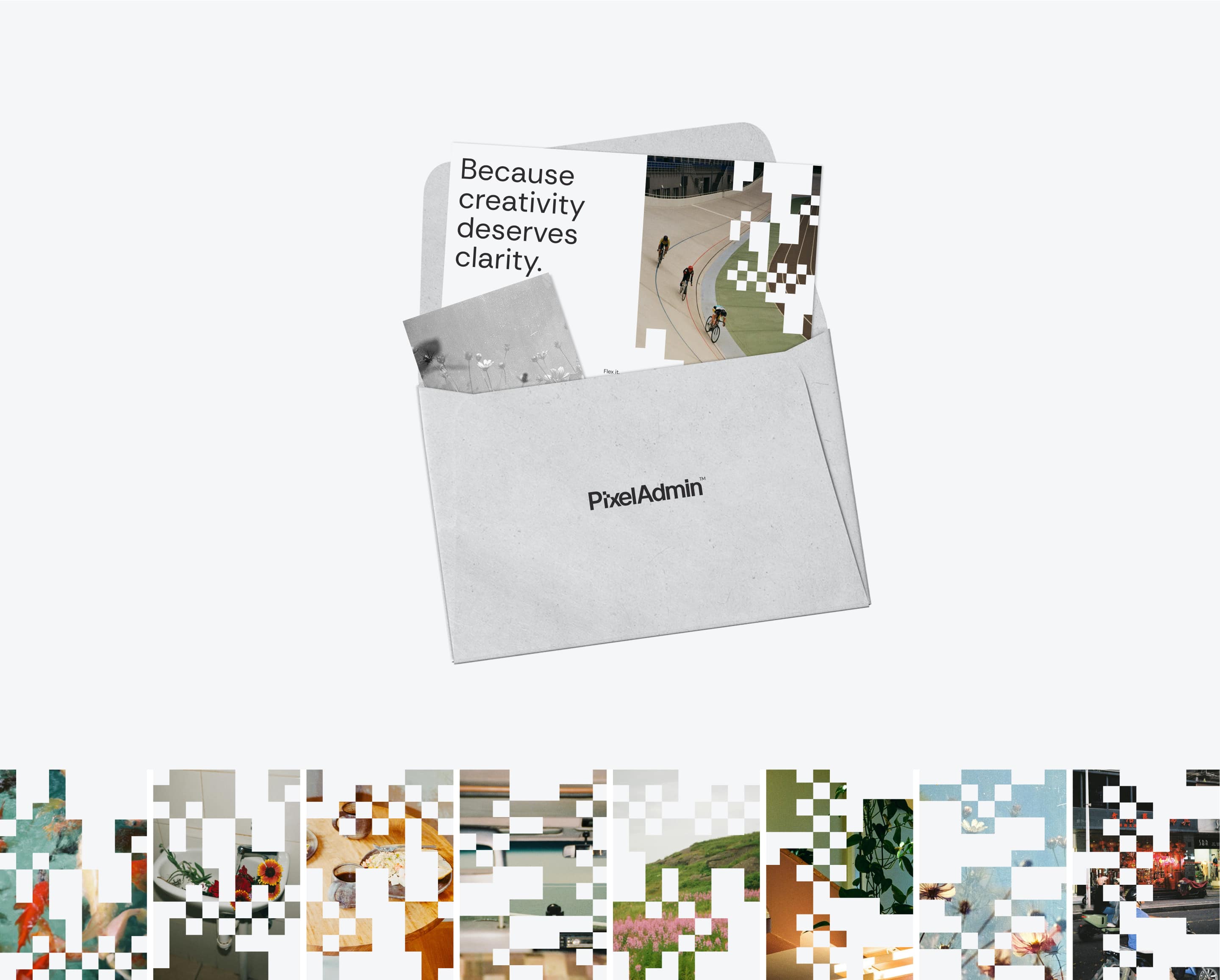
This pattern serves as the basis for the graphic elements. It can be duplicated, rotated, mirrored, or multiplied. You can use it as a mask or simply overlay it on photos in the brand’s colours.

/08
.png)
/09
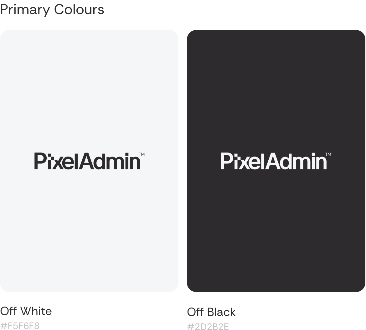
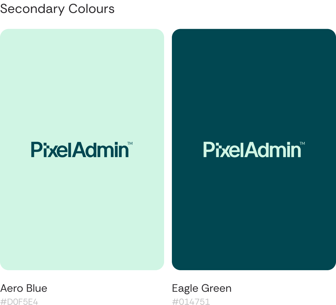
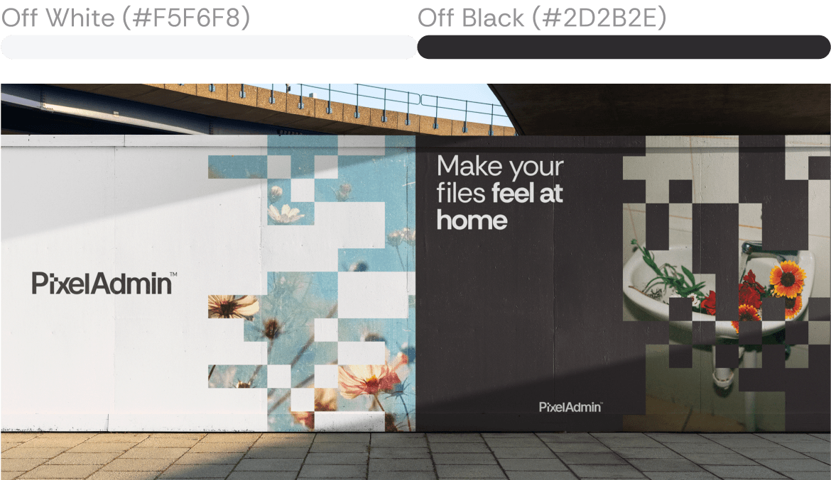
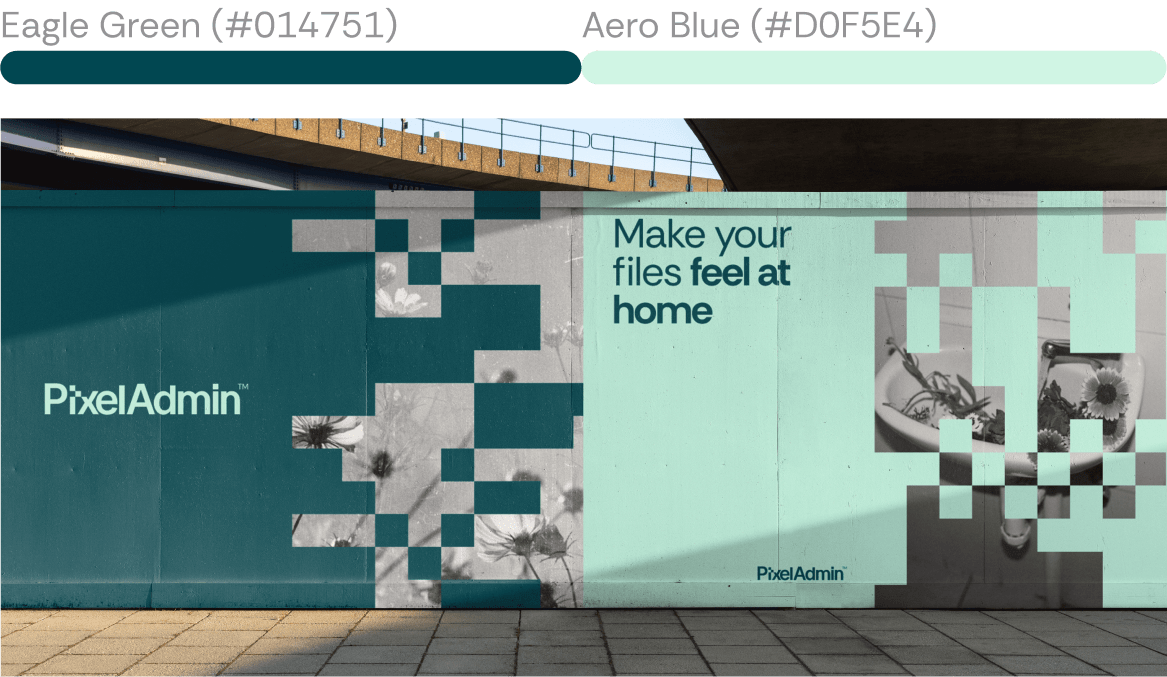
We aimed to create a genderless colour palette. Neutral, yet distinctive. Aero Blue and Eagle Green bring a subtle tech-inspired feel, evoking a sense of new technology that’s friendly and approachable, rather than complex or intimidating.
The palette was developed to work seamlessly in minimalistic compositions without the need for supporting imagery, the colours speak for themselves. This approach brings clarity and flexibility to the identity while helping avoid the overuse of brand patterns.
/10
PixelAdmin's brand identity is
designed for creative flexibility, thriving
in both digital and real-world spaces.
Its bold, adaptable system ensures a striking and cohesive presence, no matter the platform or scale.
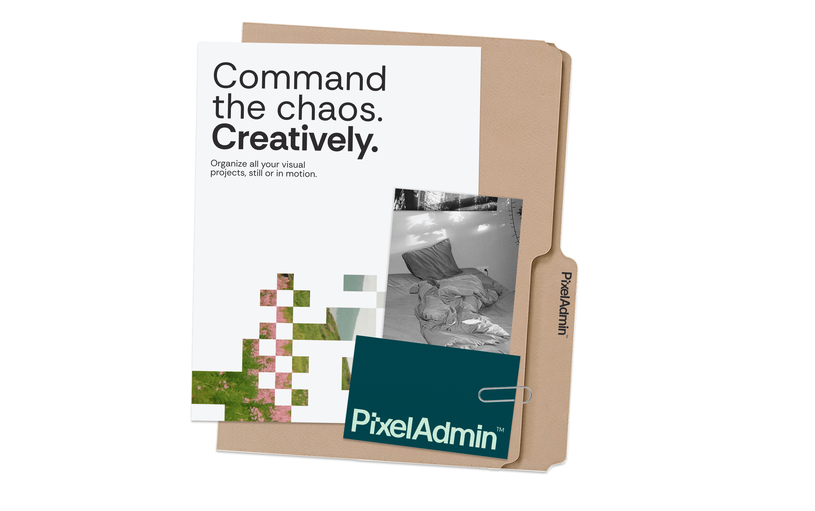
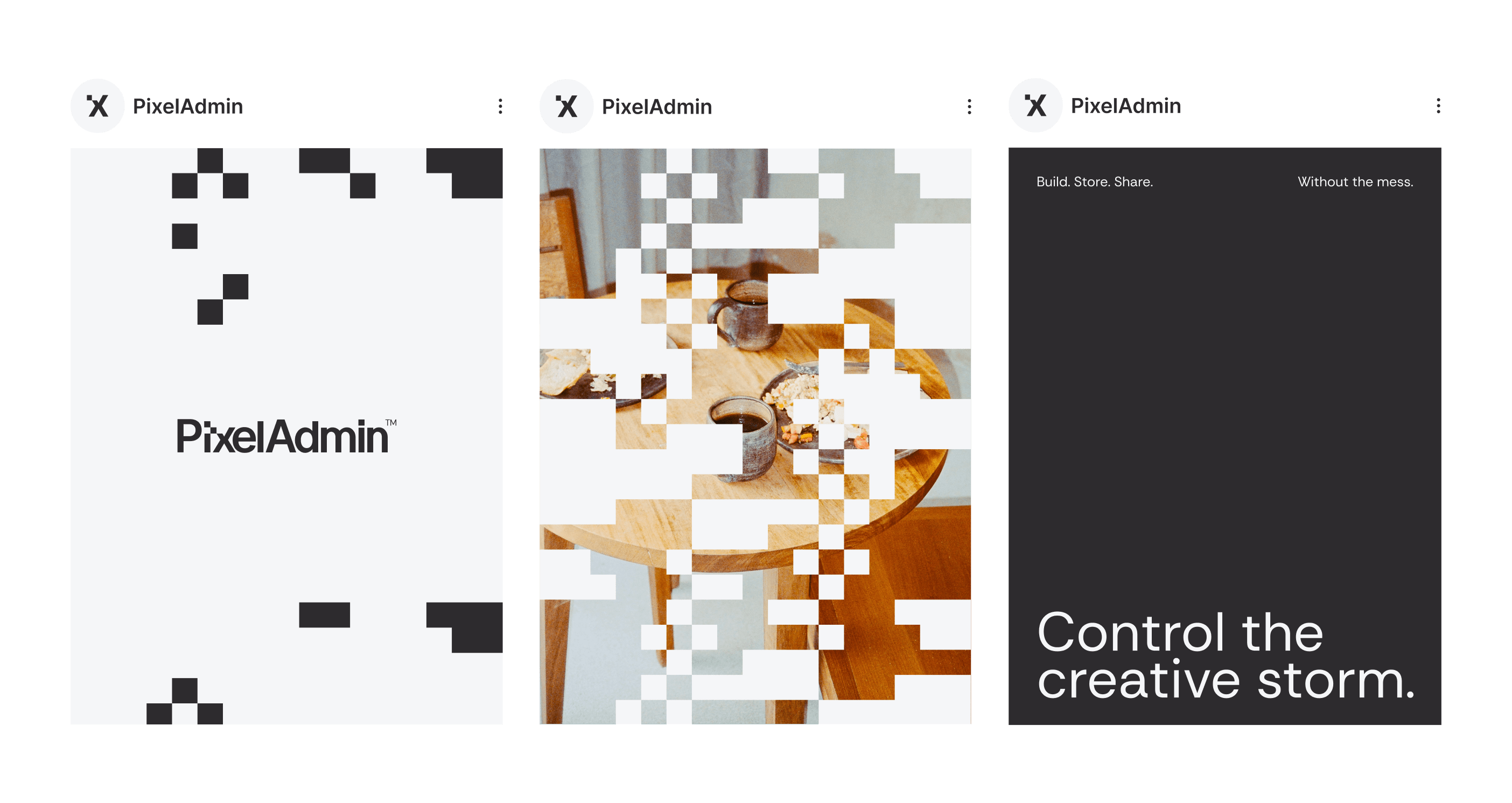
On the ground, PixelAdmin’s identity shines on event installations, creative studio signage, packaging, and branded merchandise, bringing clarity and energy to every touchpoint where creators connect and collaborate.
The identity adapts effortlessly to social media, websites, digital ads, and motion graphics. It’s equally impactful in print, OOH campaigns, and content for new formats, empowering PixelAdmin to support photos, videos, and motion design as the platform evolves.

/09

Having helped us develop our brand strategy and contributed massively to our new website copy, we’ve not actioned them to help test and create our GTM strategy. Every piece of work we’ve collaborated on they have been professional, on time and dedicated to providing high quality and impactful work. We couldn’t be happier and will be working with them a lot more going forward.
Check the full review on clutch
.png)
founder
/11
We collaborated closely with the PixelAdmin team, exploring a spectrum of bold and creative directions. Each concept drew on different metaphors and visual ideas, capturing their vision for an organised, empowering, and creative platform. Every option was thoughtfully evaluated to ensure it reflected PixelAdmin’s innovative spirit before we arrived at the final identity.
/12
.png)
Co-Founder